Collect 2025
During my visit to Collect 2025, I noted various works and displays throughout the exhibition.
The first gallery I noticed was Objects Beautiful. I didn't like how busy the display was; it was cluttered, and the pieces needed space to breathe. As well as this, I found the silver lint cloth material the pieces were displayed on looked cheap and tasteless. I also didn't like the nails, as well as the clear acrylic used to hold the pieces in place. The hand-written labels on the round silver stickers also looked careless and messy.

Busy display

Display using nails to hold the pieces in place


Back view of brooch pin

Clear acrylic stand displaying jewellery on
Another Gallery which caught my eye was The Goldsmiths Fair. This is a gallery and organisation with which I have aspired to work since I first came across them at Collect in 2023. This year, they had a display of 100 rings made by 100 different artists who have exhibited with the Goldsmiths Fair over the last 100 years.
It was very crowded arounf the rings so i wasn't able to take photos of all of the rings I liked however I did manage to get photos of some of them.
Castro Smith is a jeweller whose rings I have liked for some time. His work is incredibly detailed. The use of colour with ceramic plating adds a unique quality to the work. This is a technique which I wasn't aware of before coming across his rings, however it is something I will look into in the future for my work.
The other rings below all resonate with me for different reasons. These include either material choice, techniques such as filigree using wire, geometric aspects to them, the level of attention to detail or the use of colour in the work. These are all elements which I wish to include in my work.
I liked the display for the rings, I thought that the public was allowed to hold and try on the rings so freely was a nice idea, as usually most people wouldn't be able to do this. The idea of weights attached to each ring on the underside of the display was also clever. I believe this approach added a personal tpuvh tp the display and the customers.

Ring by Castro Smith

Ring by Caitlin Murphy

Ring by Joanne Thompson

Ring by Huimin Zhang

Ring by Filipa Oliveira

Ring by Nina Bukvic
Ring by Lynne MacLachlan

Weights used to display rings
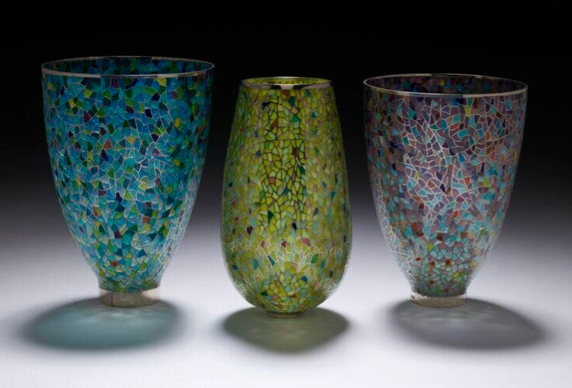
Li Yinglong Plique á Jour's work is incredible. This is the only work I saw there using this technique. These vessels were small, however, they weren't displayed very well. They were in the corner of the room with clear boxes covering them. This kind of work would benefit most from being in a space where the viewers could walk around and natural light could shine through the transparent glass. However, this wasn't the case with how they were displayed, which I found to be a shame, as these pieces weren't shown to their full glory.

Plique á Jour Vessel by Yinglong Li

Plique á Jour Vessel by Yinglong Li

Plique á Jour Vessel by Yinglong Li
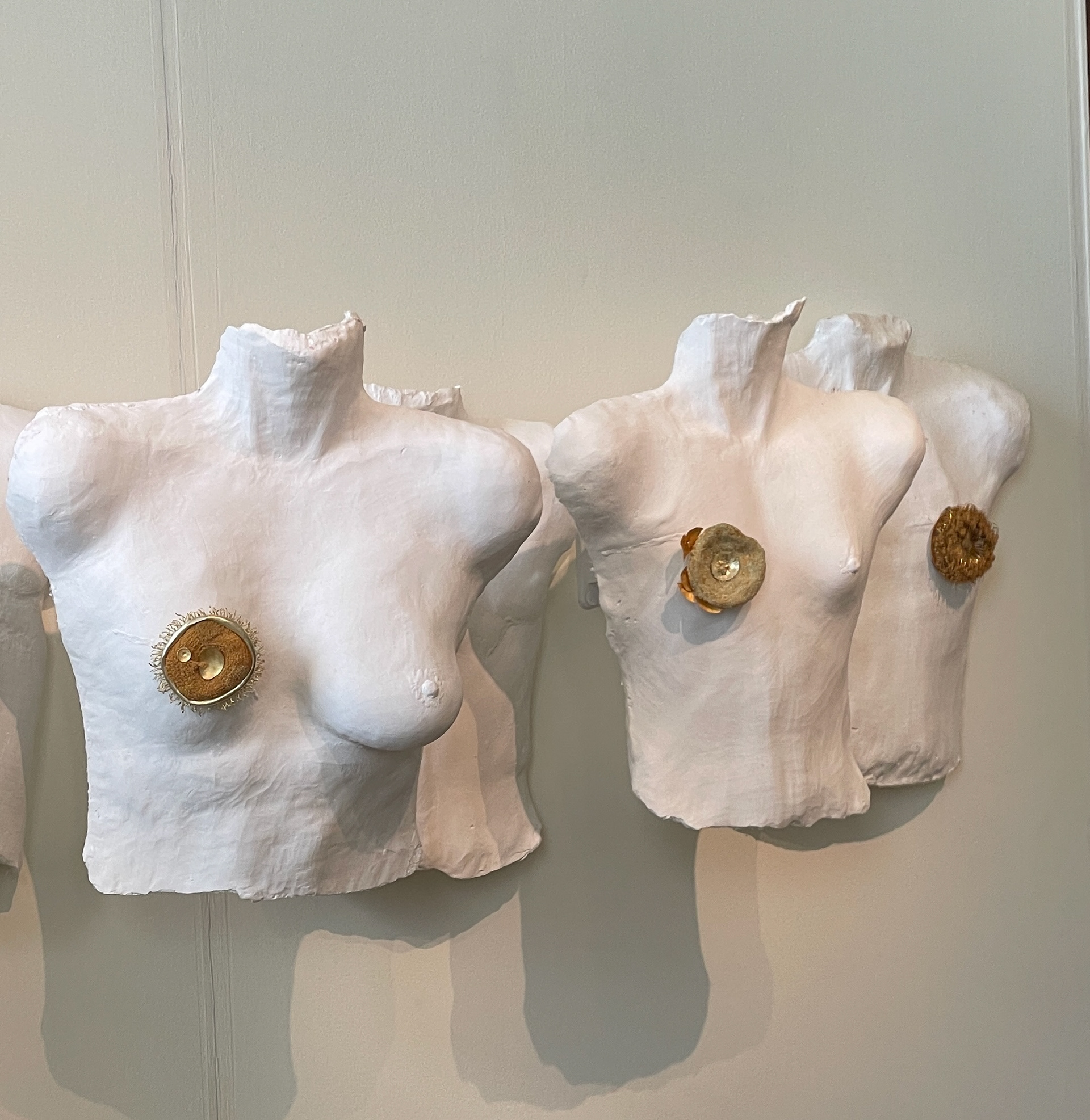
Another gallery which stood out to me was the Craft Alliance Atlantic Association. I liked the use of colour with the display wall, however, keeping the pieces on a white background. Something I like about this display was how they hung the brooches on the walls. You can see this in the middle photo. This was discreet and a sturdy support for the brooches.

Craft Alliance Atlantic Gallery Display

Brooch attachment to the wall plinth

Brooch by Pamela Ritchie
The display at the First of March Gallery, I didn't like. It was too complex, and where some pieces were displayed, it meant the pieces got lost within the display, meaning they could easily be missed by viewers, which isn't fair for the makers.
At the Contemporary Applied Arts Gallery, I saw Claire Underwood's work. I had seen her work online before visiting Collect. She uses enamel in her work, and I found that she uses this in a contemporary and fun way. I like the movement of the enamelled pieces. However, her work was displayed on these clear acrylic stands, which I found cheap, considering her work is priced quite high. The text on the stand wasn't readable as it was upside down and backwards, which I believe is to be able to pick the stand up and see, however, I think there are better ways to do this. This let the work down.
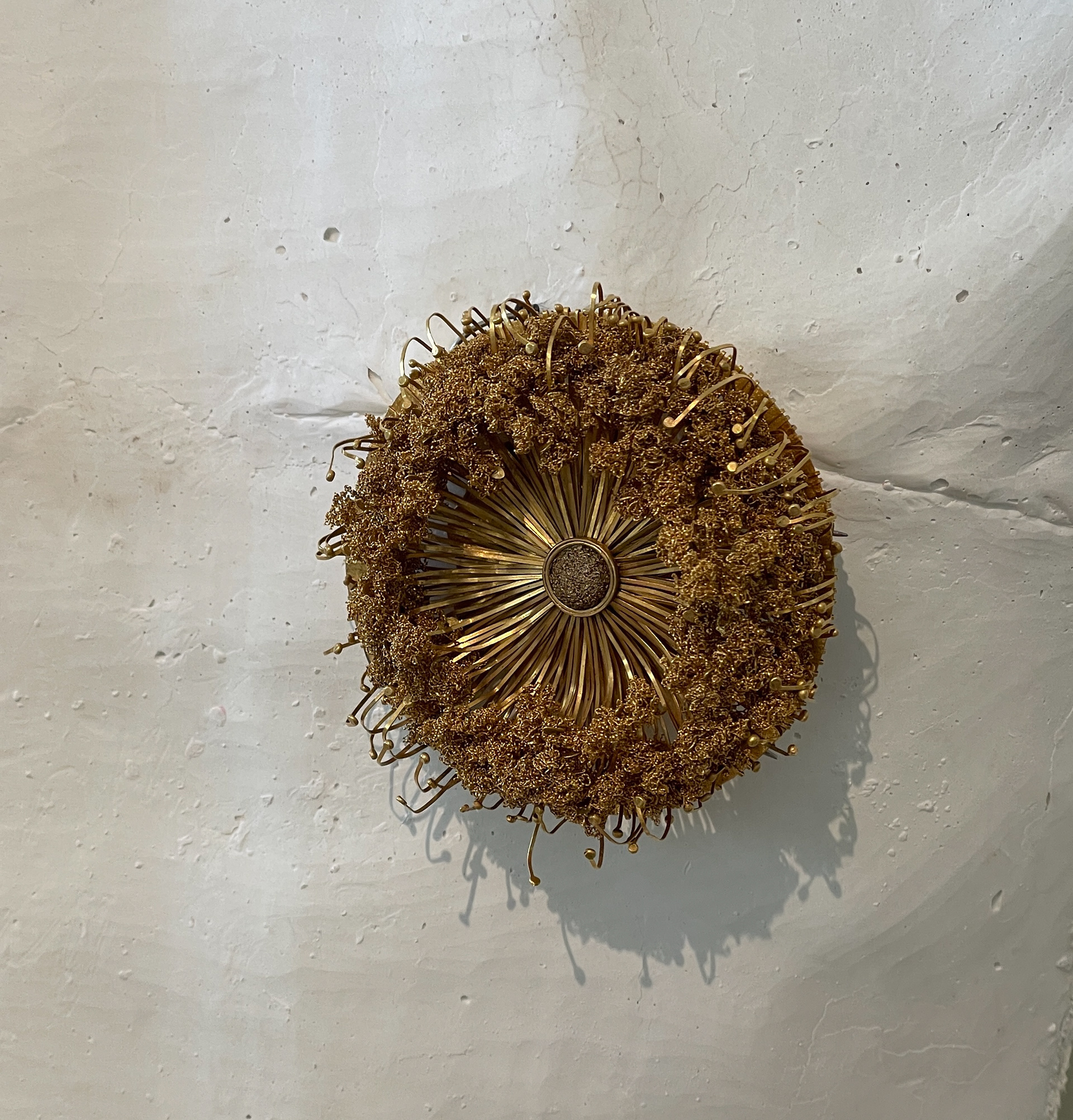
Thrown gallery had a notebook where you could write down your email address to join their mailing list. I only saw this gallery doing this. I am not to sure what i thought about this, whether I liked it or not. The Goldsmith's Fair had various pieces of work displayed on what looked like some sort of foam board. I liked the discreet method of hanging this necklace as shown in the photo further to the right.

First of March Gallery stand

Claire Underwood jewellery Display

Thrown Gallery Mailing list

Attachment example at Goldsmiths Fair
Huimin Zhang's work was I first saw at The Great Northern Contemporary Craft Fair in 2024. She has easily become one of my favourite makers. Her work is incredibly inspiring and intricate. She makes her gold wire as fine as human hair. The story of her work is also beautiful, which I believe was displayed well at Collect Open, where she exhibited this year.
Huimin Display
Brooch by Huimin

Epona Smith vessel

Epona Smith vessel

Stefano Marchetti Brooch

Stefano Marchetti Brooch

Qin Zhang Brooch

Qin Zhang Brooch

Ceramic sculptures by Darren Emenau

Ceramic sculptures by Darren Emenau

Jessica Jue Bowl

Jessica Jue Bowl Detail

Detail of Kyeok Kim work

Detail of Kyeok Kim work

Kyeok Kim sculptural work
Overall, I enjoyed going to Collect and found it quite inspiring. It was interesting to go and look at how work was displayed rather than just the work itself. I found there was a mixture of good and bad examples of how to display and curate work. This was valuable for me to learn from, which I can apply when considering how to display my work at The Degree Show and New Designers.
Goldsmith's Fair - Interwoven: Jewellery Meets Textiles
Whilst in London, I also visited an exhibition at the Goldsmiths Fair. This jewellery meets textiles exhibition was interesting. Some of the artists' work I had already seen at Collect; however, most of it I had not seen before. I find this level of intricacy and skill admirable. This, as well as the refinement of these pieces, is something I aspire to achieve in my work.

Explanation of exhibition

Explanation of exhibition

Work by Misun Won, Ann Sutton & Susan Cross

Back of Brooch

Bracelet by Megan Brown

Brooch by Megan Brown

Brooch by Caitlin Murphy

Bracelet by Megan Brown

Work by Sue Hiley Harris

Pearl Cuff by Teri Howes

Necklace by Andrew Lamb
Degree Show Practice Exhibition
During the practice exhibition, I explored displaying my work on a black background and a white one. I found that on my work being displayed on white works best. This is due to the light reflecting through the Plique á Jour, making the enamel brighter. As well as this, the white background looks better against the black brooch.
I also explored having the brooches in a straight line or having them scattered over the space. I didn't have a preference on what I prefer; however, I think having them scattered makes better use of the space.
In addition to this, I tested them on different shelves and plinths of different heights compared to the tabletop I was using. From this, I discovered my brooches will benefit from being a little higher up than the table I used. I felt they were at a better height for viewers to see the light through the enamel.

Work displayed on black background

Work displayed on white background

Side angle of work

Brooch on a shelf

Using white tac to stop Brooch moving

Side view of Brooches

Testing brooch

Brooch held further away from lights

Brooch held closer to lights
I also used some Blu-Tack to hold the round brooches in place. Even though the brooch could stand on its own using the pins, I found that when walking around the table, the movement made the table and brooches move, potentially leading to them falling over. To avoid this, I will buy some clear rubber strips just to help hold the piece like the Blu-Tack did.
Artist Research
Yenna Yoon
Yeena Yoon is a jeweller with a background in architecture. She has a particular interest in fine gold wire work and gemstone carving—skills she was able to further develop through her QUEST Scholarship. As part of the scholarship, she participated in a one-to-one course with Giovanni Corvaja, where she learned advanced techniques for working with fine gold wire and innovative bonding methods.
Her work reflects an architectural mindset and a deep appreciation for materials and their possibilities. A key aspect of her practice is that every piece is handcrafted. She is interested in all types of stones, their inherent qualities, and their potential. Her jewellery embodies symbolism and preciousness, serving as a means of communication and personal expression.
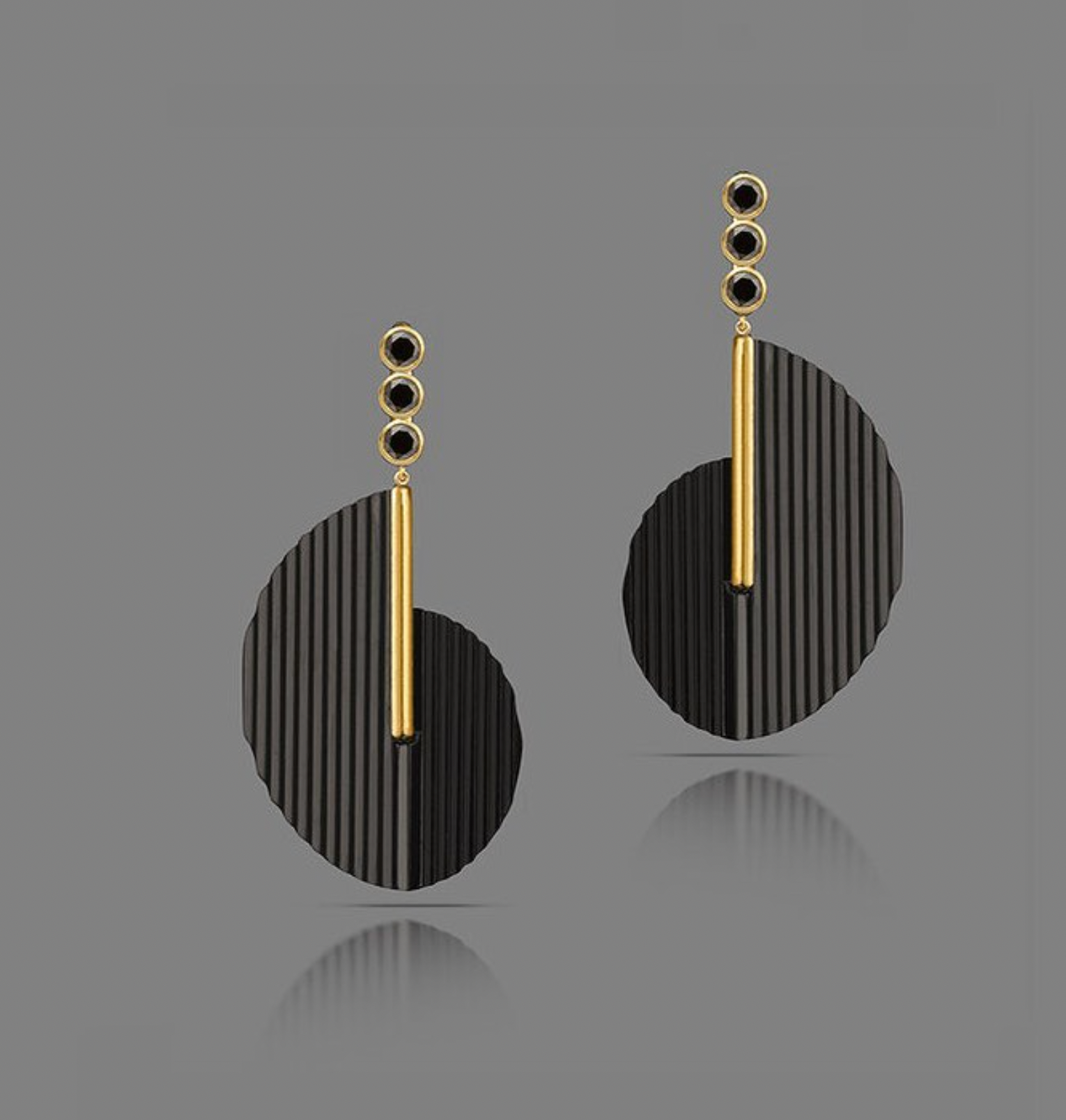
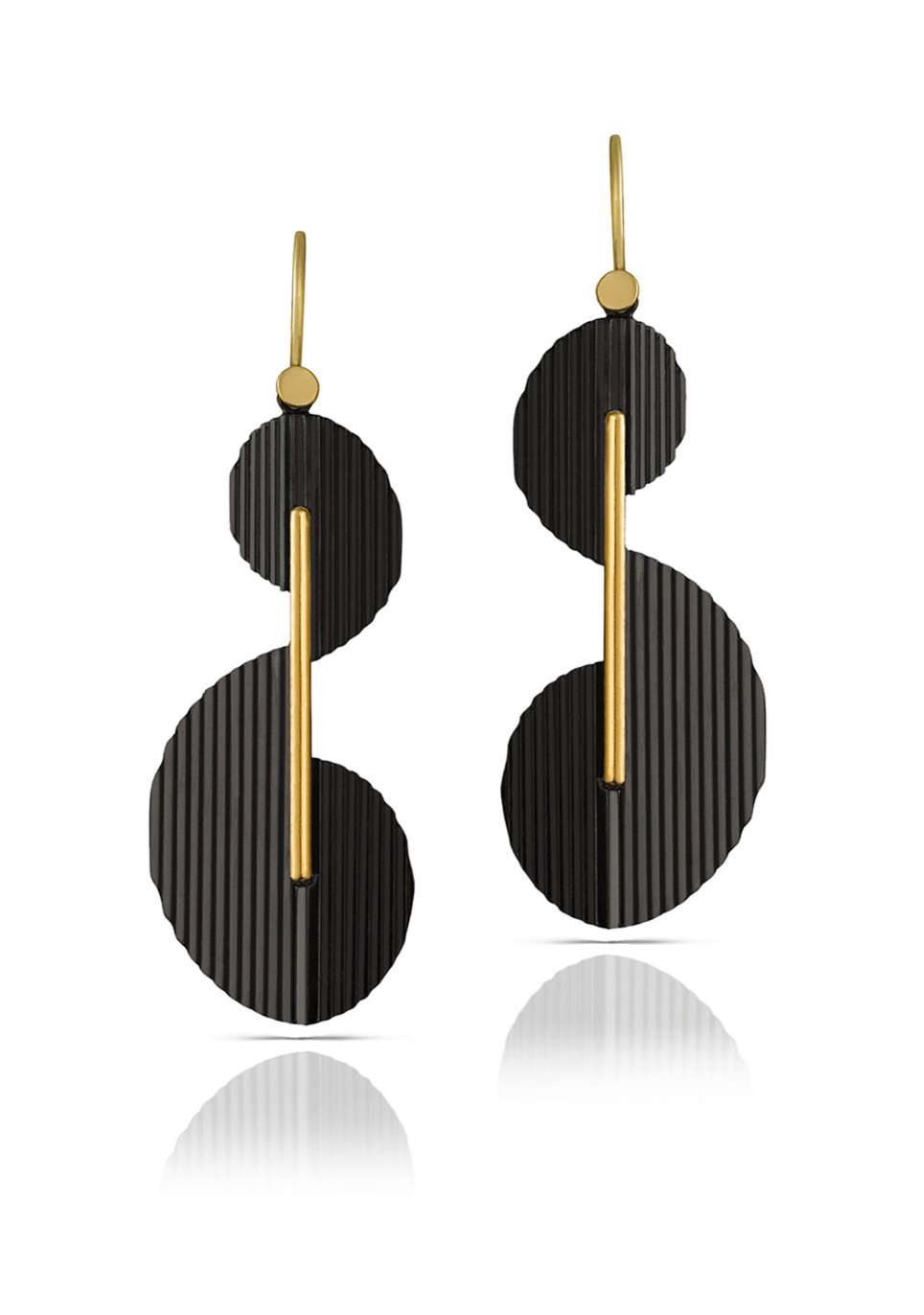
Some of Yeena Yoon’s work features a matte black finish. I looked into this and discovered that it is achieved through Black Ruthenium Plating, done by Elliot Fitzpatrick. Unfortunately, I only found this out during the last couple of weeks of this unit, so I wasn’t able to try it myself, but it’s something I plan to explore in the future.
I find the context of Yeena’s work very relatable. I’m also interested in gold wire work, and the idea of meeting and taking a course with Giovanni Corvaja would be a dream. What Yeena has accomplished in her career so far is truly inspirational to me, as these are the kinds of opportunities I hope to pursue myself. I also strongly connect with the emphasis she places on handcrafting and personal expression in her work, as these values are equally important in my creative practice.
Jiro Kamata
Jiro Kamata is a contemporary jeweller and goldsmith whose practice combines refined techniques with non-traditional materials, particularly various types of lenses such as those from cameras and eyeglasses. He initially worked with old, repurposed lenses but later collaborated with a lens company to create his custom designs.
His work explores optical phenomena and the relationship to the perception of value. His jewellery is playful and reflective, engaging with light and colour in unique ways. I find his work highly interactive-the wearer is invited to look through the lens and experience the world from a new perspective, forming a personal connection and story through the act of wearing his pieces.
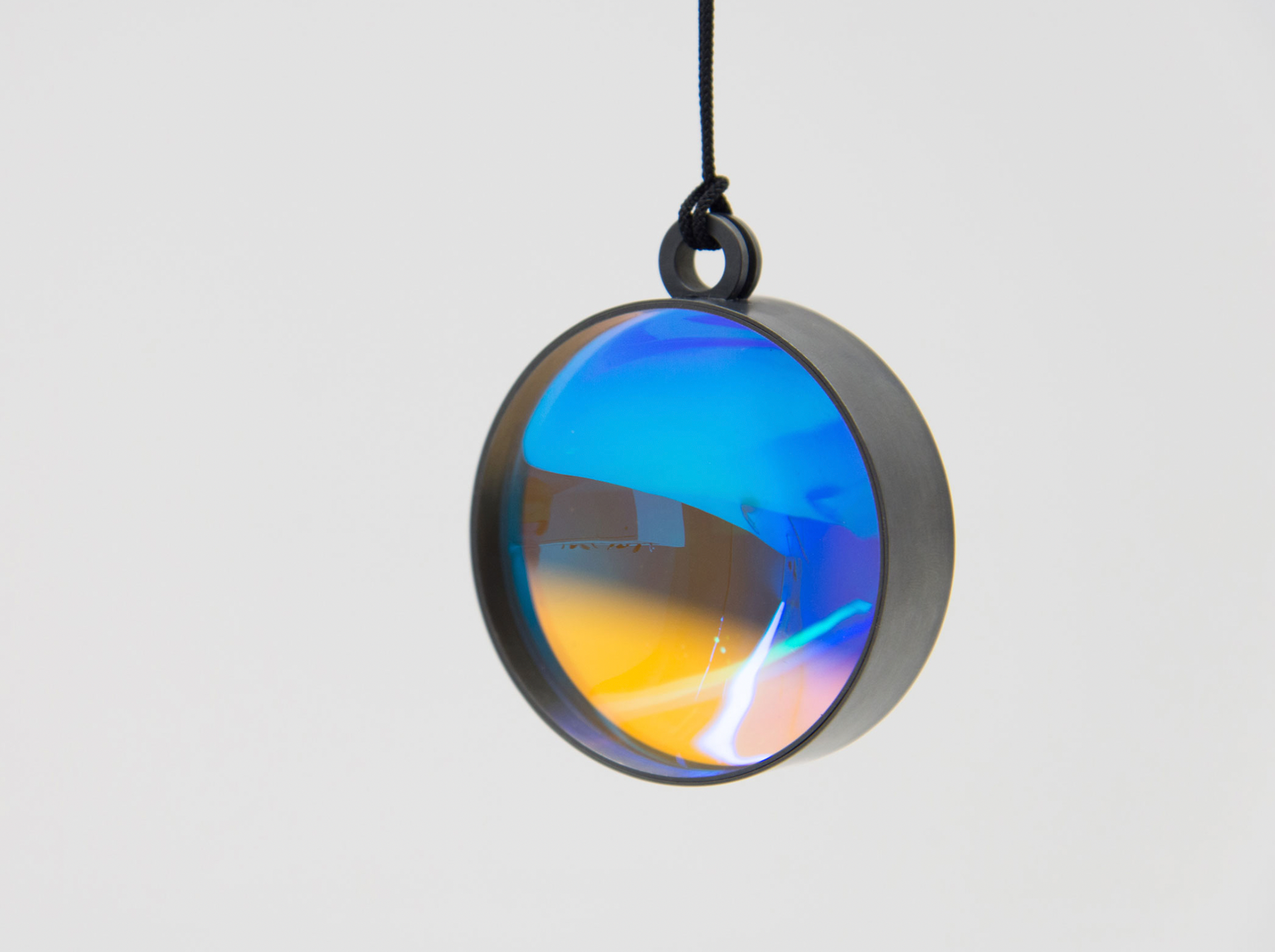
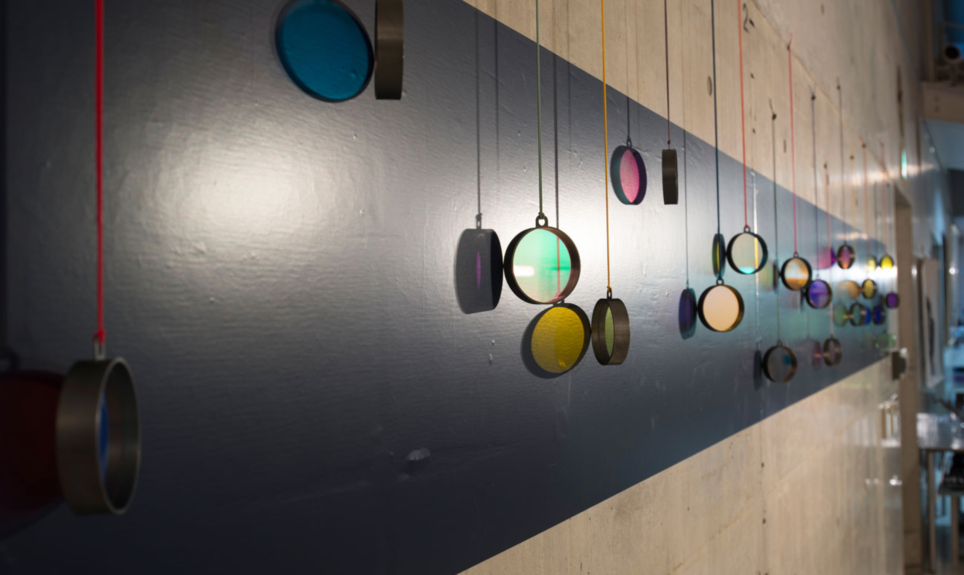
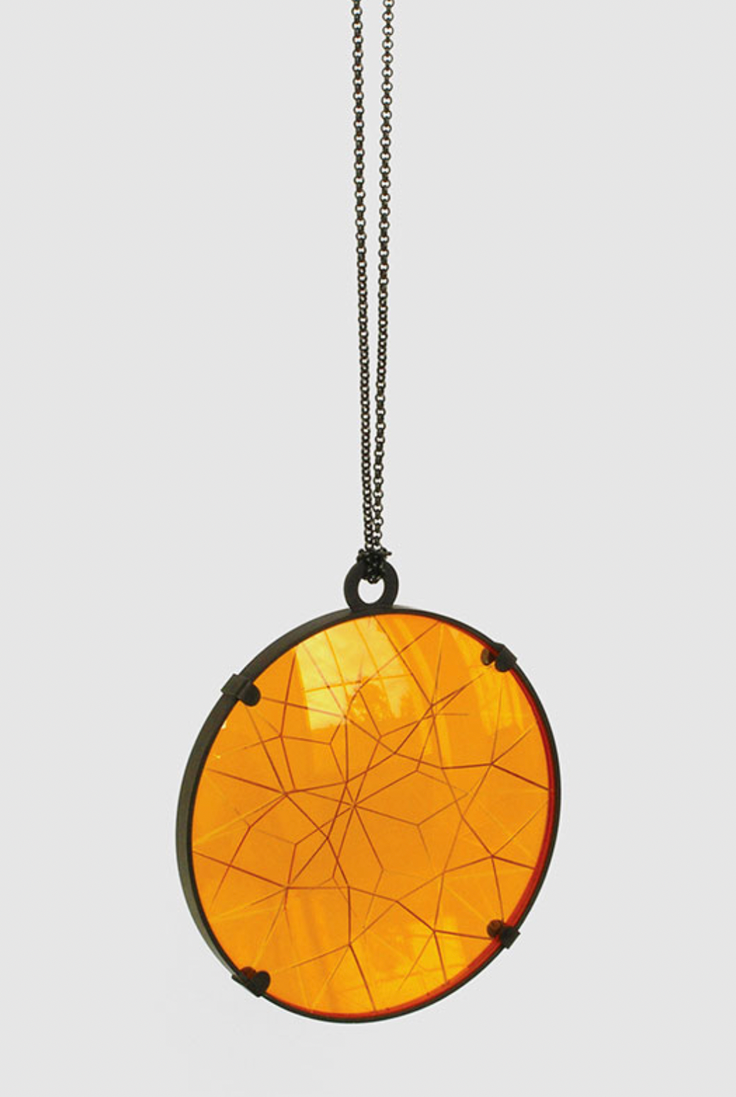
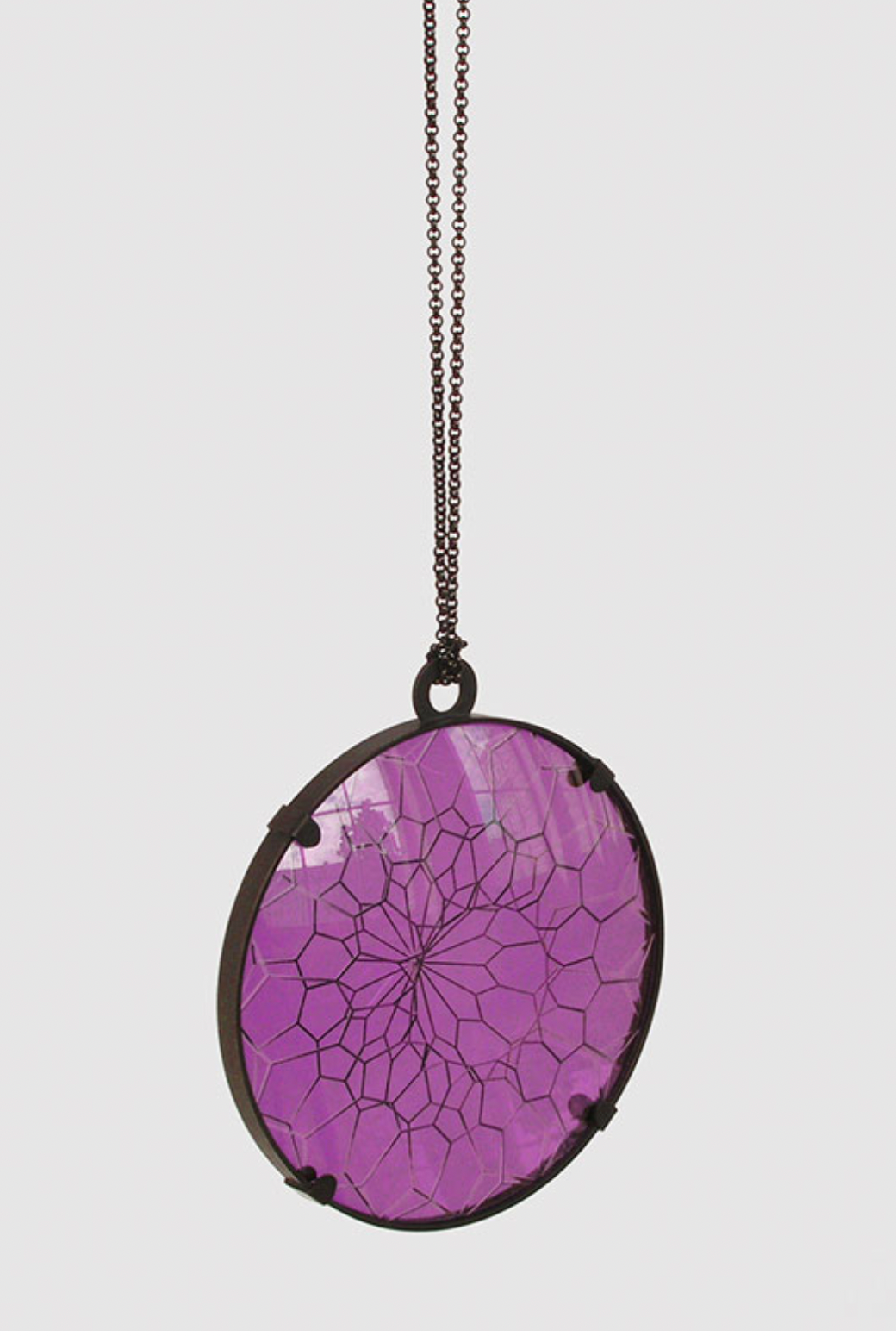
What I find most interesting about his work is its interactive quality. The jewellery invites the wearer to engage with it physically and visually, seeing the world through a different lens. This interactivity turns the object into a personal experience, one that is continually reshaped by context, movement, and perspective. His concept of storytelling through material and form resonates with my belief that jewellery can be both personal and transformative.
Jiro's work pushes the boundaries of what jewellery can be, opening up possibilities for narrative, perception, and engagement. It encourages me to think beyond conventional techniques and materials, and to consider how the wearer's interaction can become part of the work itself.
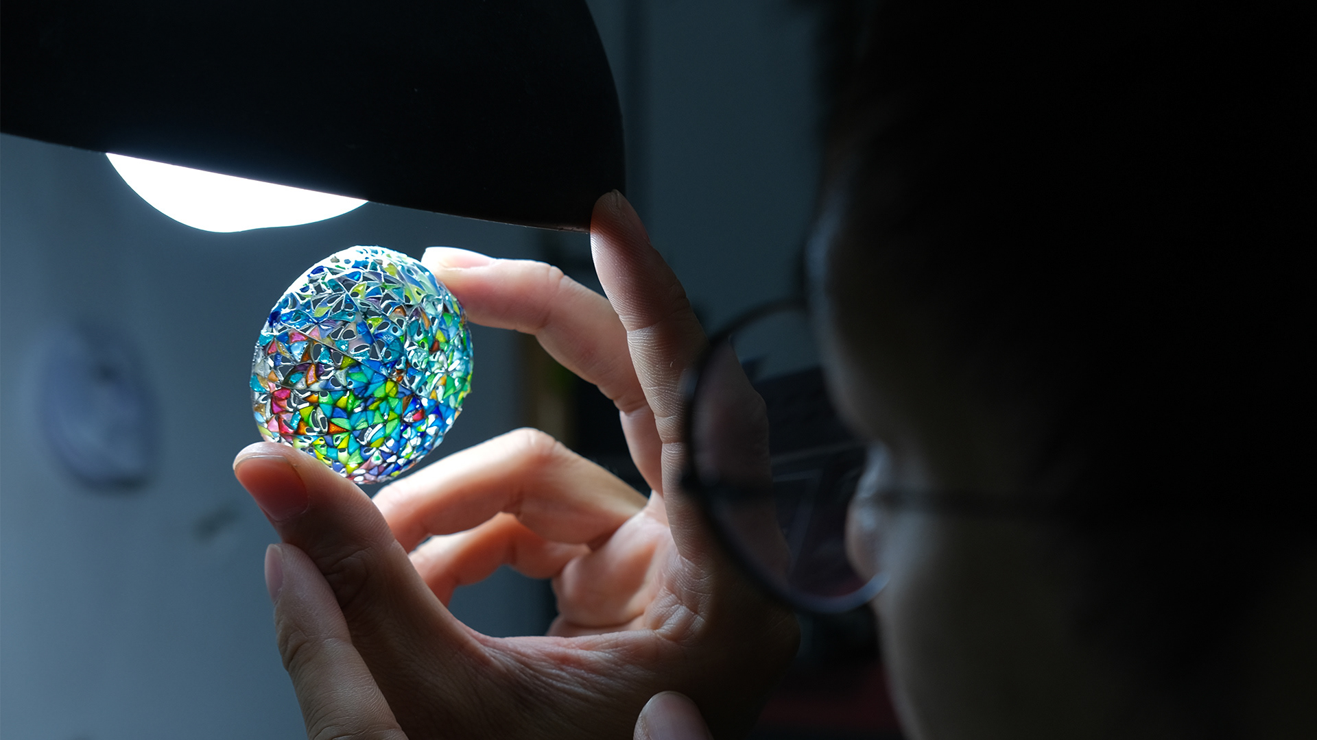
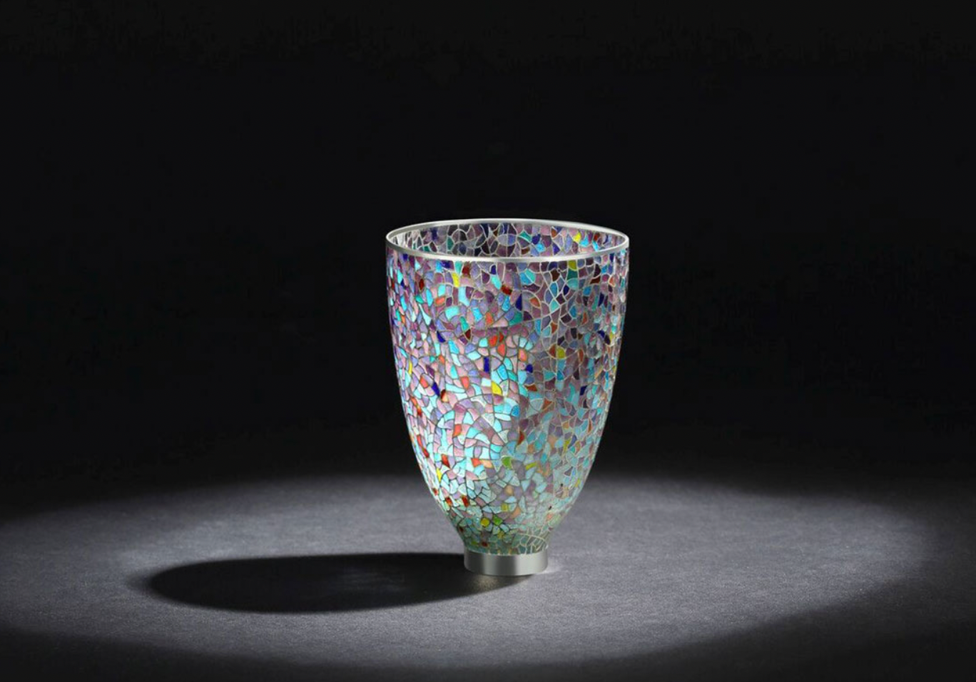
Yinglong Li
I first saw Yinglong's work at Collect 2025. I found his work incredible and wanted to research him further, as this was the first time I had come across him. He studied for a PhD at the Birmingham School of Jewellery, focusing on the boundaries of the traditional technique plique-à-jour while combining it with modern technology such as selective laser melting. His innovation of the technique allows the enamel to become part of the structure of the piece, rather than serving solely as a decorative aspect, as it traditionally does.
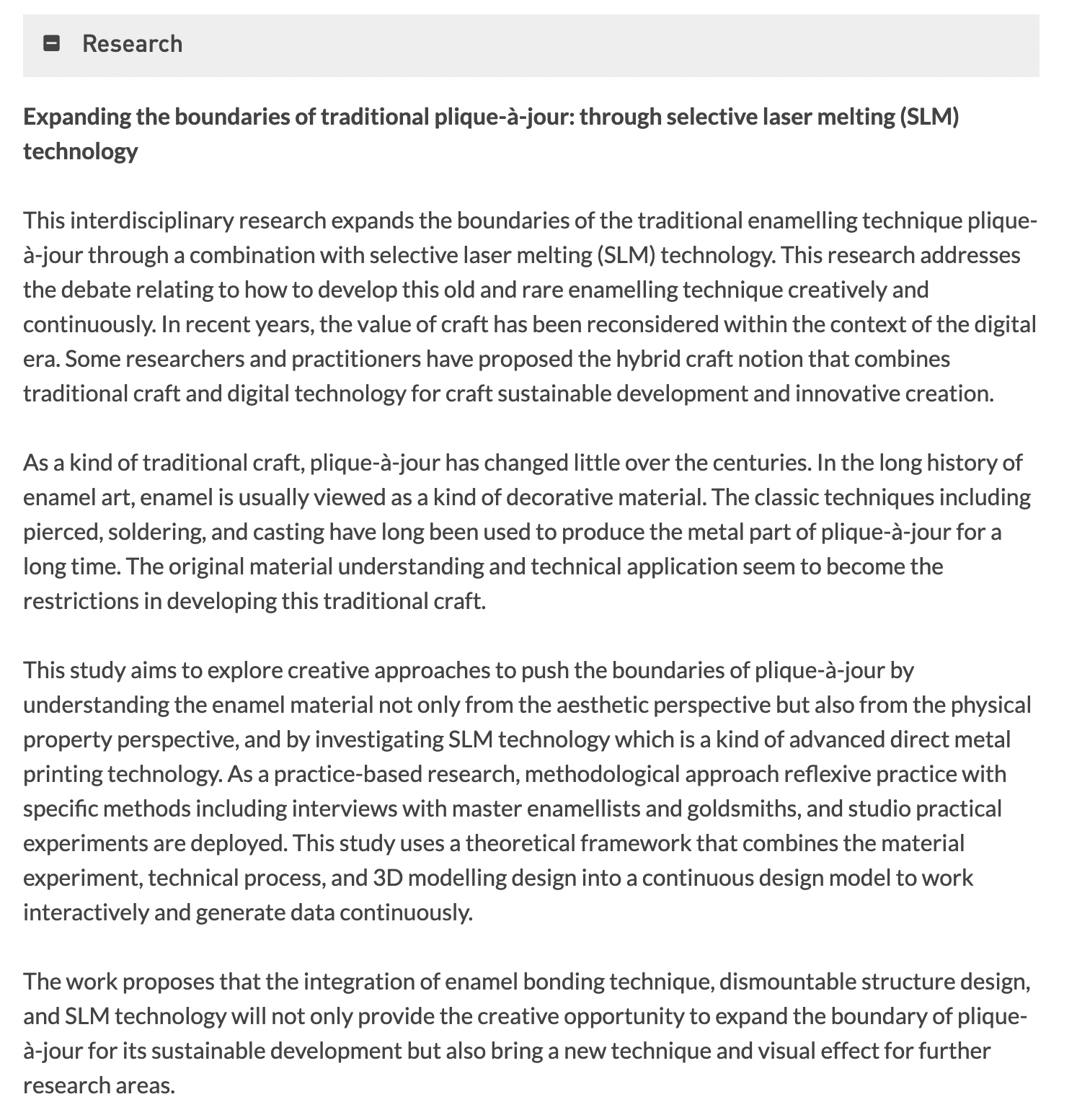
Research by Yinglong
This is incredibly inspiring for me, as what I am trying to achieve with my work is similar in the sense of pushing the boundaries of technique and its potential. Yinglong has studied this new method for years, conducting extensive tests to understand how to create his pieces and explore the properties of the materials he works with. This level of dedication is something I aspire to. I hope to develop my own concept in a similar way—refining it through research and experimentation, and gaining a deep understanding of the process, just as Yinglong has done.
I messaged Yinglong Li in the hope he would be teaching any classes on Plique á Jour in the UK, as this would be an incredible experience and help me a lot. His response was extremely welcoming and friendly, and I will take him up on his offer to contact him regarding any questions.